
UX Research Lead & Designer
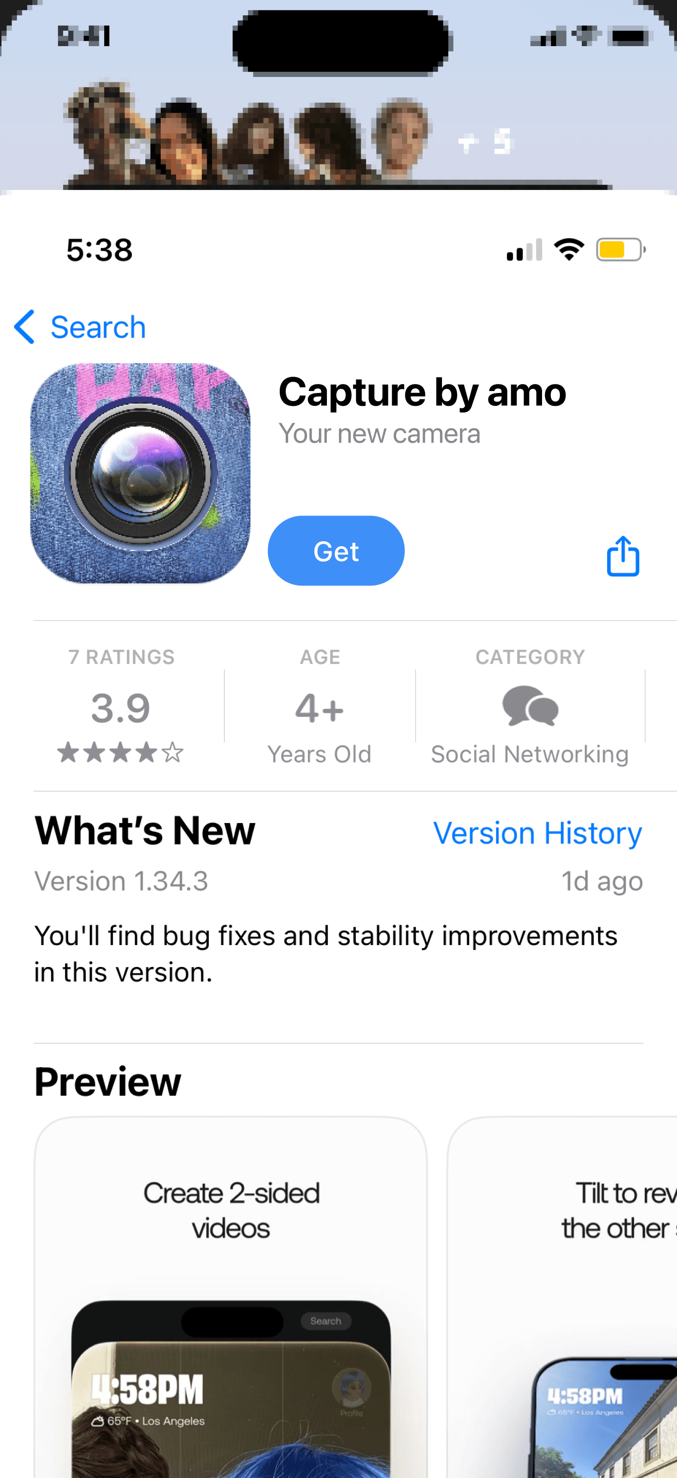
During my PM internship at amo, I led user research and designed core UX improvements. Combining insights from over 50 user interviews and product analytics, we identified key friction points in the friend invitation flow. Based on these findings, I designed improvements to the onboarding experience that significantly increased viral growth and conversion rates.
Additionally, I designed UX/UI that leveraged new iOS functionalities, such as App Clips and widgets, to improve new user engagement. I also established and managed a global localization system, coordinating with 30 localizers and engineers to launch and maintain 3 apps across 15 languages with daily releases.
SPENCER'S SCOPE
Product Management
UX Research
UX/UI Design
Localization Lead
TIMELINE
Post-Grad Internship (Sep. 23-Mar. 24)
TECH COLLABORATORS
Kevin Bessiere, iOS Lead
Maxime Gerardin, PM
Jose Goncalves, UI Designer
LOCALIZATION COLLABORATORS
Jason Akakpo, iOS Lead
Cyril Mottier, Android Lead
Finding Friends on amo
A UX Research Case Study
The Problem
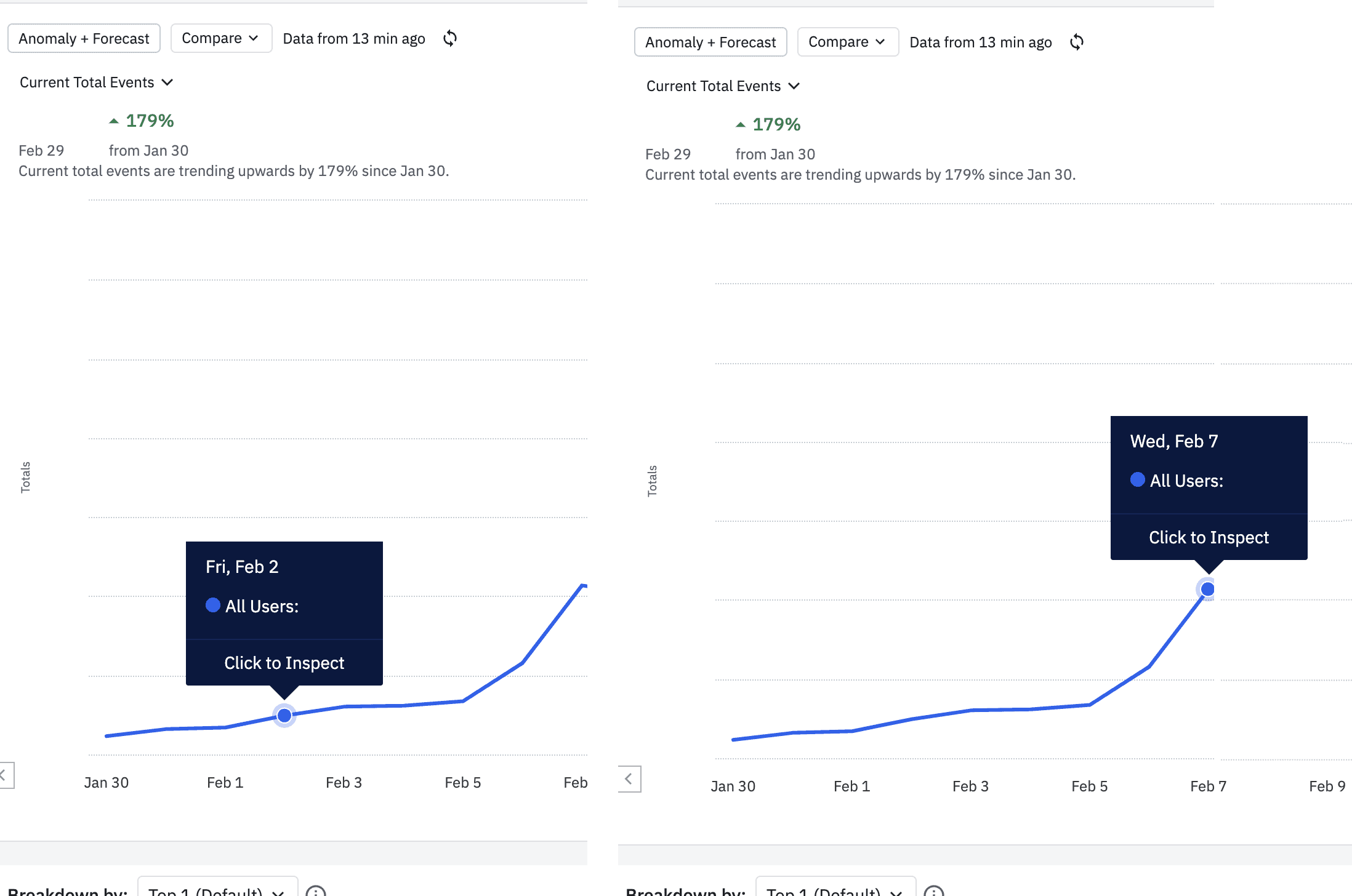
In social apps, the k-factor (viral coefficient) measures how well each user brings in new users, and when a k-factor is greater than 1, on average each user brings in more than one new user. At amo, we measured our path to a K factor > 1 by one clear early indicator: how many users invited at least one friend within their first day.
Part of my UX research mandate was to optimize the friend invite flow and increase invites sent for new users. The core problem I identified was that users struggled to find relevant contacts within our invitation flow. What made this a compelling problem to solve is that users had already showed high intent—they'd already granted contact permissions and were ready to find friends to share the app with.
Research Methodology
For all user tests at amo, we prioritized in-person sessions with participants in our target demographic (18-30) to capture detailed interactions and identify potential bugs.
Our dual-camera setup enabled comprehensive feedback:
One camera recording facial expressions to capture emotional responses
Second camera focused on screen interactions to track usability issues
After each session, we compiled the footage and shared findings with the team across three main categories:
Wins: Successful interactions and positive responses
Improvements: Areas needing UX refinement
Bugs: Technical issues with documented reproduction steps for engineering in Linear tickets
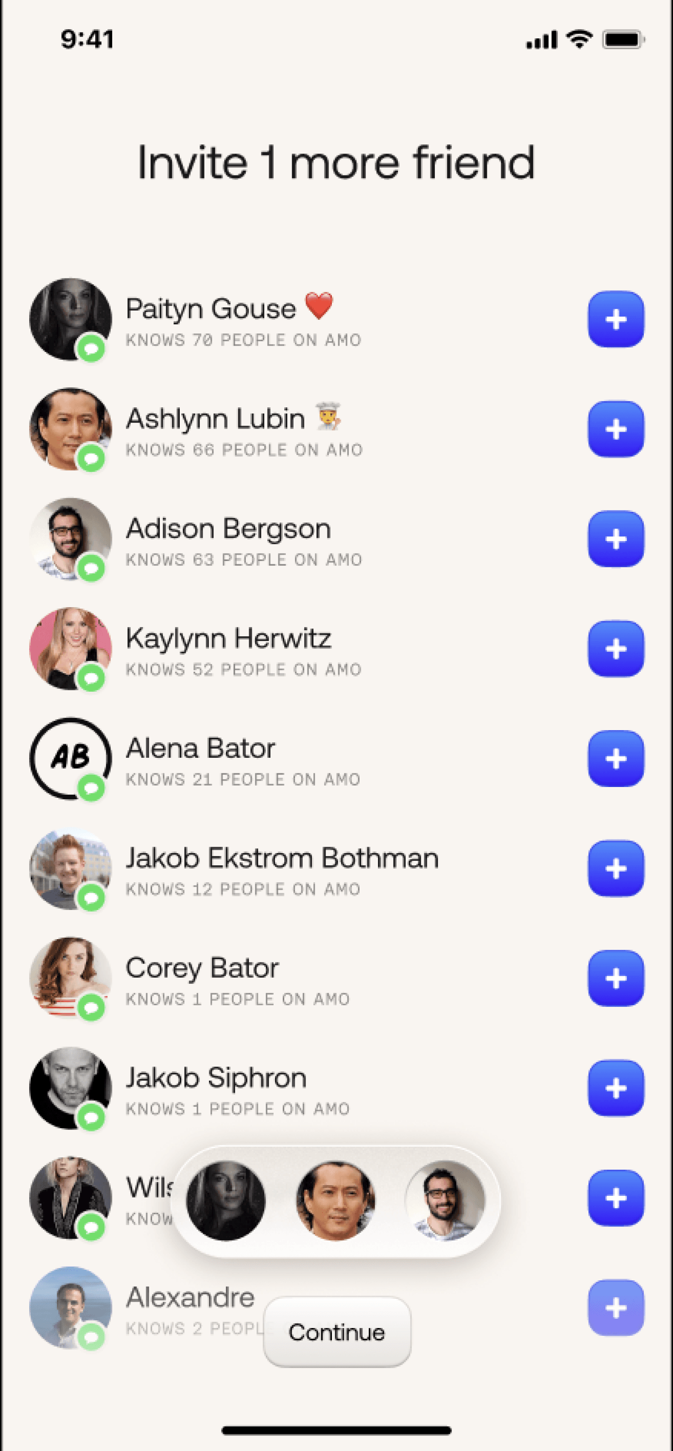
Example User Session
Product Data Analysis
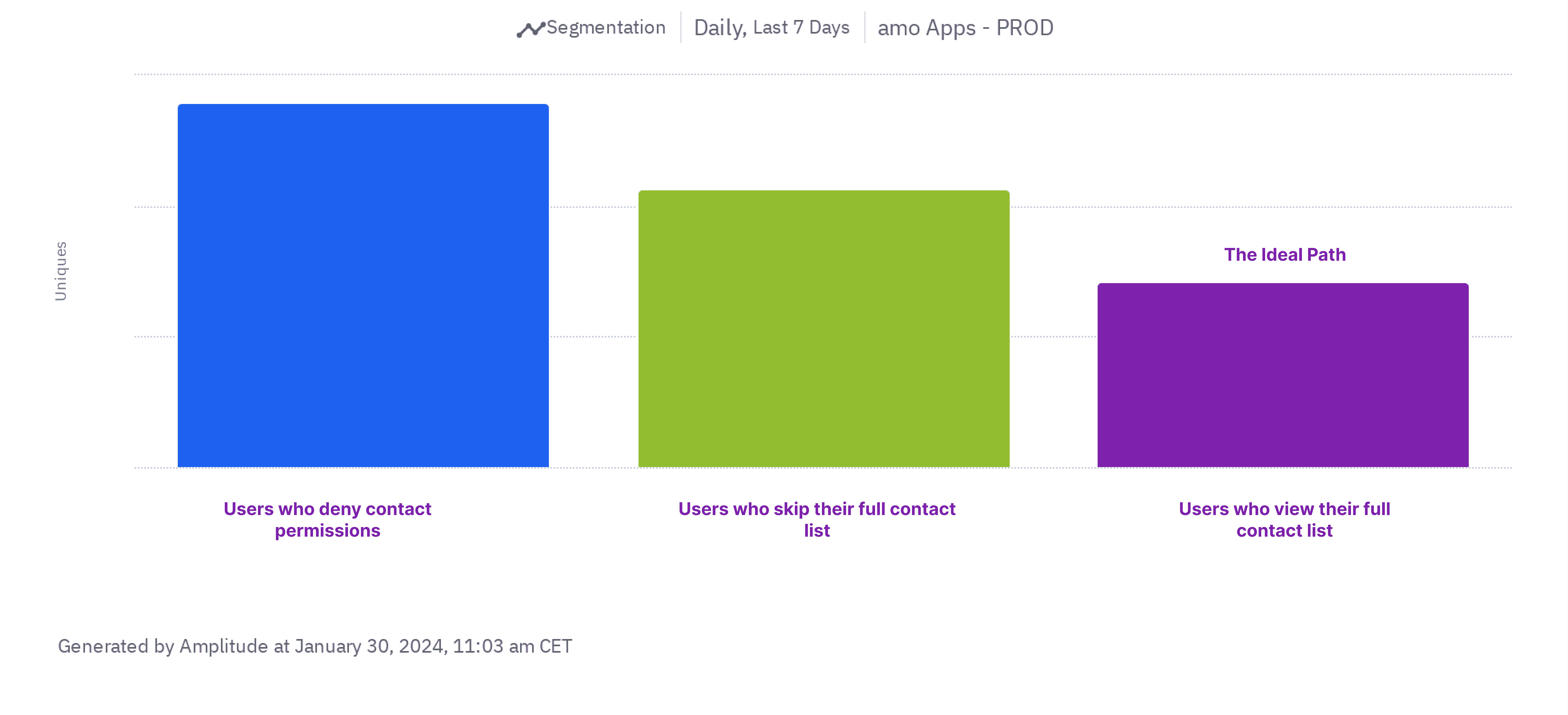
Using Jane's session as a starting point, I dove into Amplitude to validate if her behavior patterns were common among users. This quantitative analysis confirmed our qualitative findings:
Most users who granted contact permissions were following the "Unlikely Friend Suggestions" path, skipping the subsequent invitation flow steps (shown in green).
The path Jane eventually found—leading to her "easy" moment—had our highest conversion rate (~23.5%) but was our least traveled path (in purple).
This mismatch between our most successful path and actual user behavior presented a clear opportunity for optimization via design.


Design Solutions
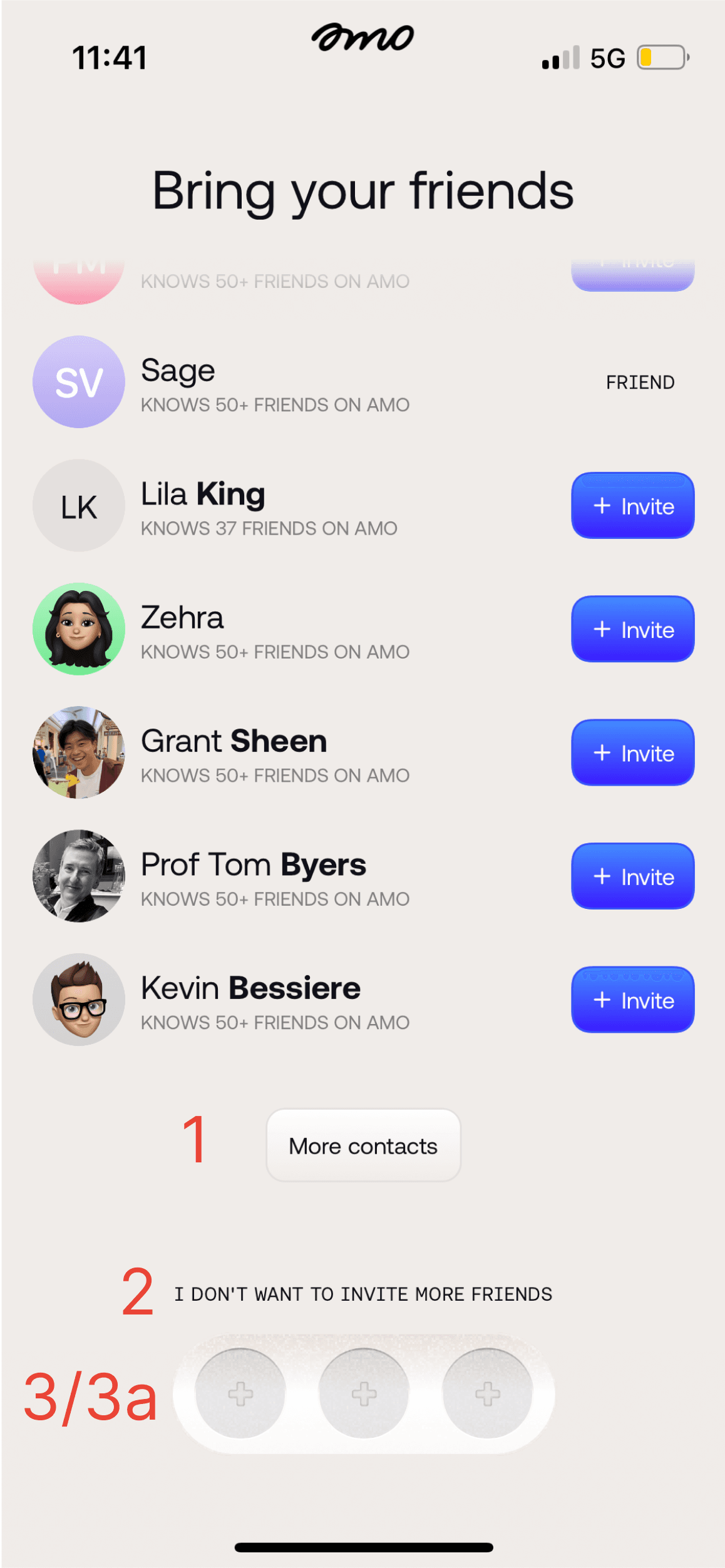
Original Experience
The initial design had a few key points of friction:
Users expected an upfront search experience; instead, search functionality was hidden behind a button
A prominent negative option ("I don't want to invite more friends") that discouraged future engagement
Unclear invitation goals despite showing three empty circles
Originally these were non-interactive UI elements that confused users
Implemented Changes
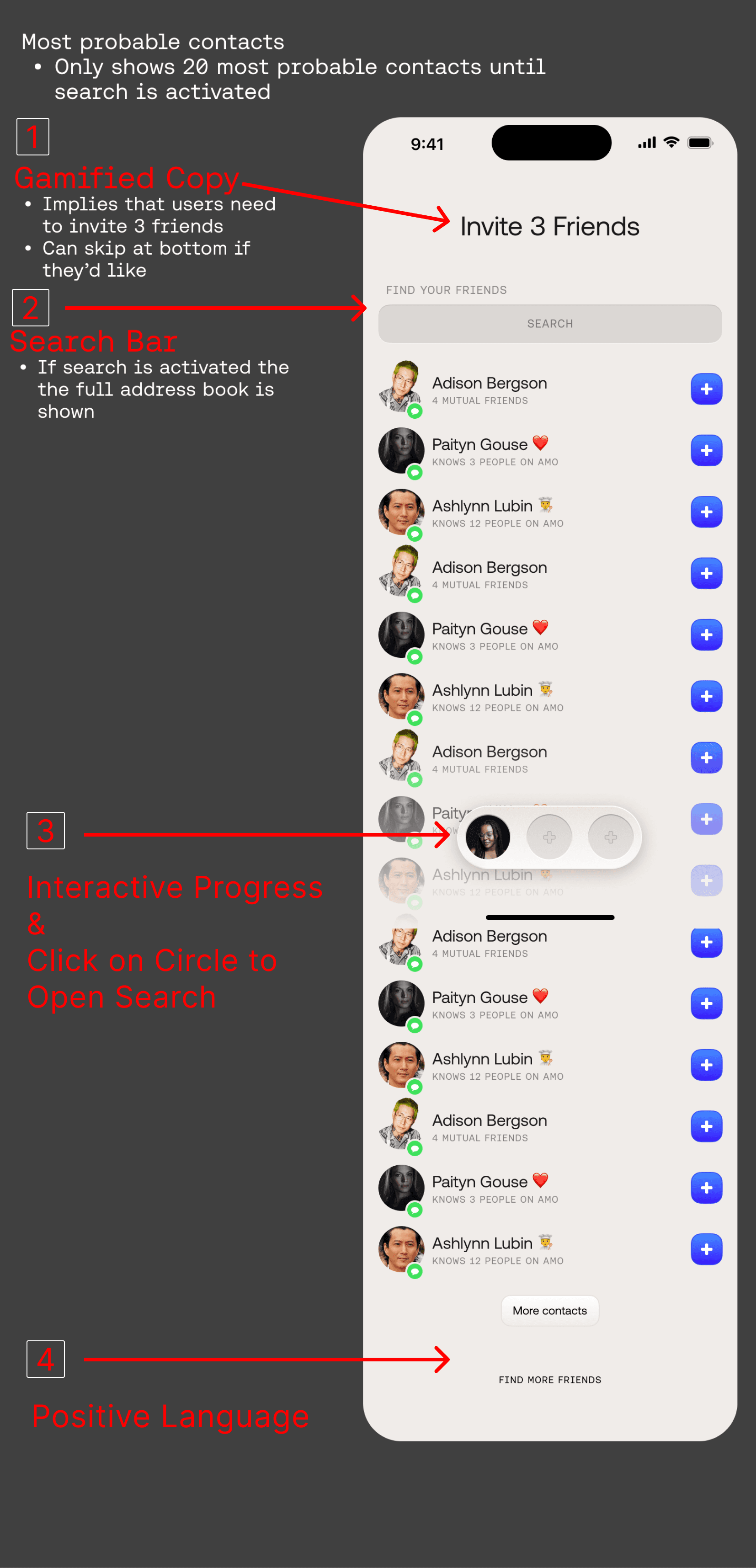
Gamified Copy Introduced copy indicating the goal to invite three friends while maintaining the ability to proceed with fewer invites.
Intuitive Search Added a search bar at the top, recognizing that users often had specific friends in mind when entering the flow. When activated, this automatically expanded to the full contact list.
Interactive Progress Made the three circles interactive and tied them to user actions, providing clear feedback as users added friends to their invitation list.
Positive Language Replaced negative opt-out copy with "Find more friends" to encourage exploration of our highest converting path.
Because I don't know the app well I usually hesitate when inviting friends. In the onboarding, I could easily find friends who I'd want to share silly photos with
These design changes led to significant improvements in our onboarding metrics:
Increased Engagement Average invites sent per user increased from 1.2 to 2.5 within a week of launching, representing a 108% increase in invitation rate
Improved Flow More users discovered and used the full contact list, our highest converting path
Better User Experience Users were more likely to engage with subsequent invitation prompts, showing our copy changes successfully reduced resistance
Timeline: Changes were put into the app on February 1st, experiment data was analyzed daily through February 9th before changes were kept in the app.